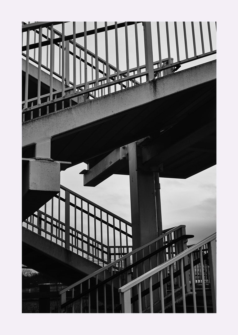
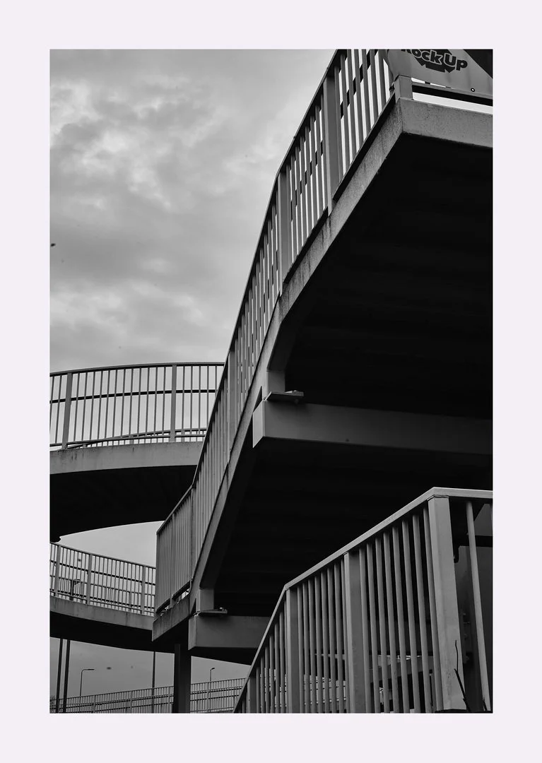
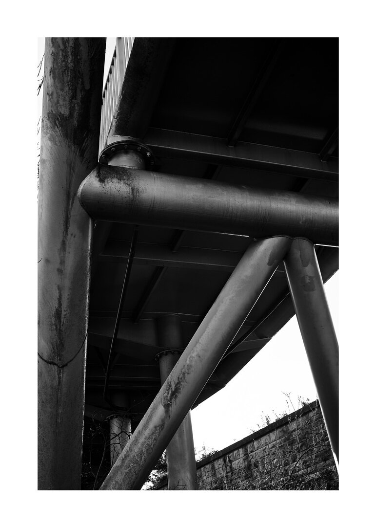
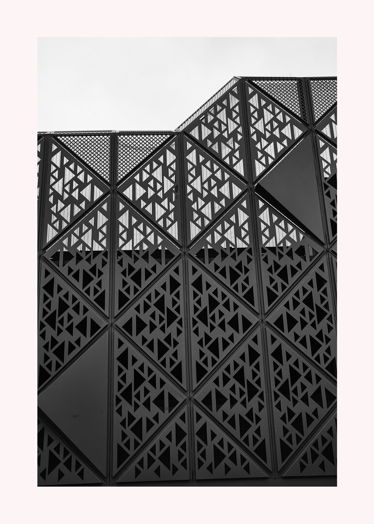
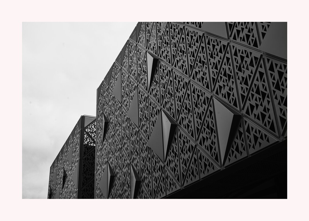
Just a few of the back end of Beckworth Emporium (the place with the spaghetti ice cream to die for) in the garden centre bit with an angry looking sky behind it.
design
Project – 'Architectural Metaphor' Update
Do you ever look above eye level when your going about your business in town centres? You should try it some time. I found the architecture of our local library quite interesting and a surprise to me. Its something I had never noticed before and although a bit Brutalist in design, it does take a good picture. Featured here are also so images of local beauty spots (?) like the Bus Station, the Probation Office and the back of an old inn of renowned destitution opposite the probation office hang out for naughty boys and girls in the area. I hope you enjoy them.
Project – 'Architectural Metaphor' Update
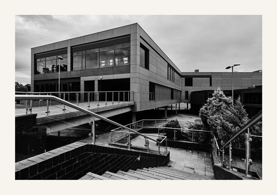
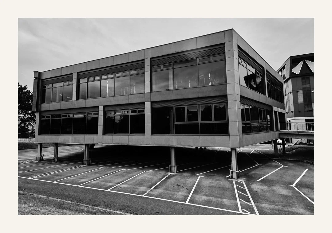
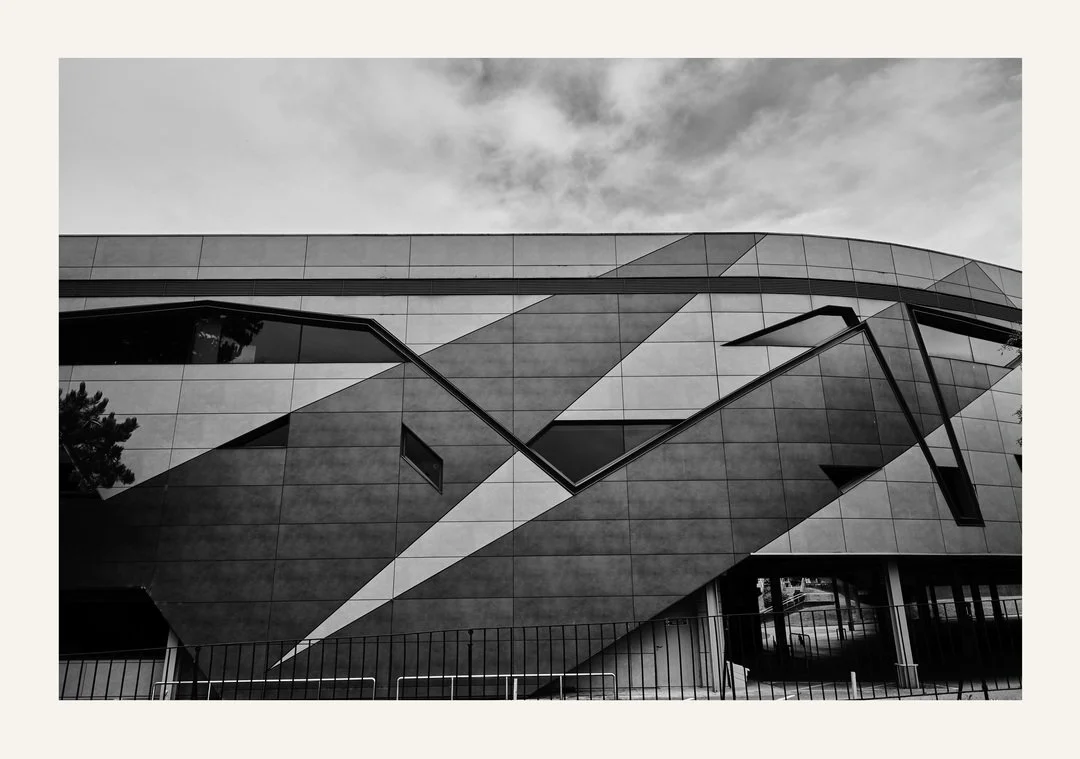
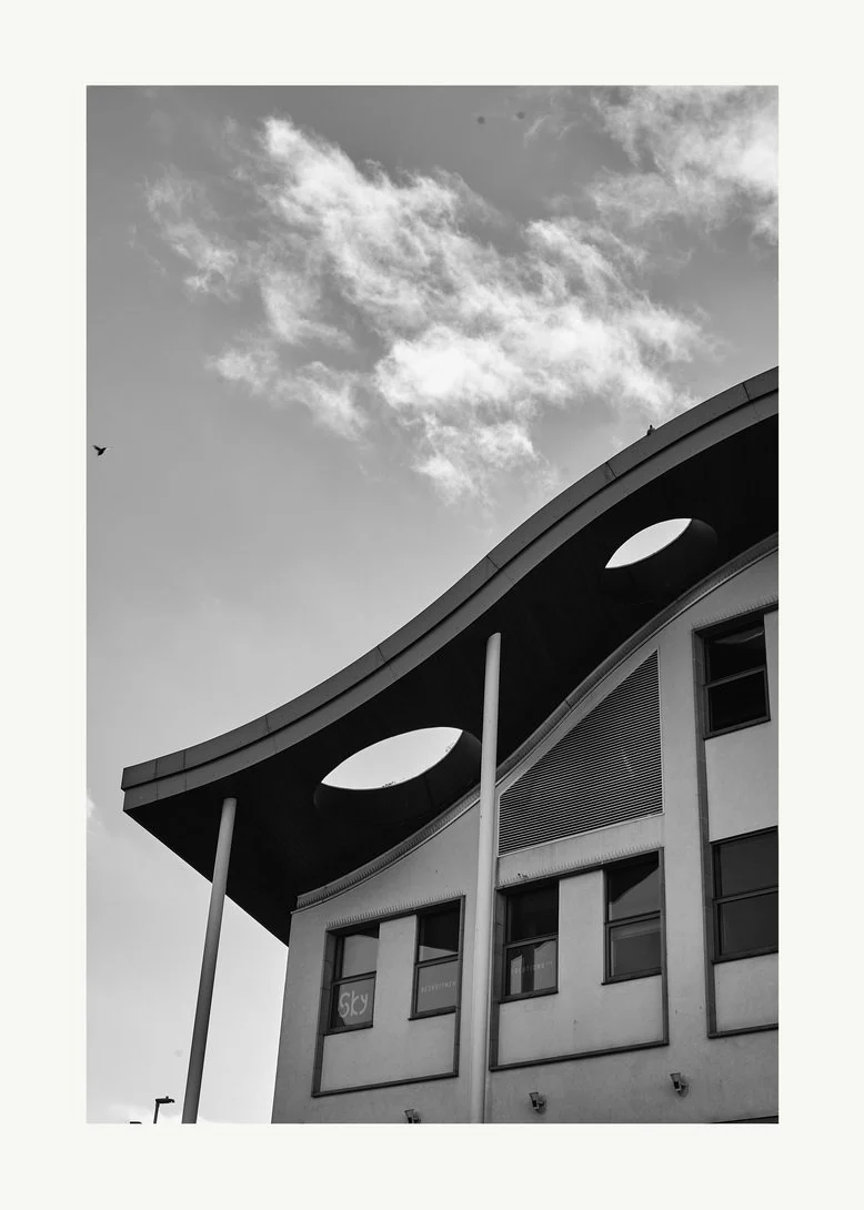
We only managed one project update this month, but we made it a good one. Getting up early one Sunday morning we took a lift to a local college to snap away at its new facia and architectural delight. The building there used to be quite drab in its 1979s style of building, but since the face lift I personally think it is a whole lot better. There was nobody around … not a soul … not even a student, so we had the place to ourselves. I strongly hope we captured its design beauty, to show it at its best? With thanks to Amy.
Project- 'Architectural Metaphor' Update
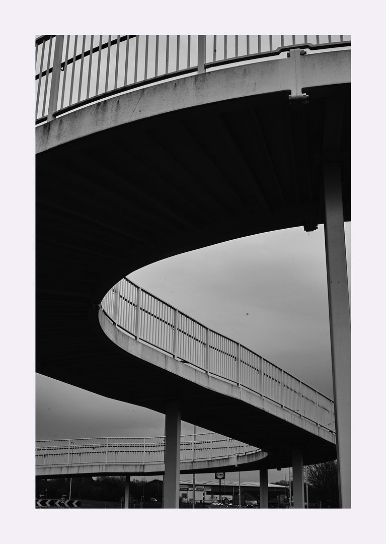
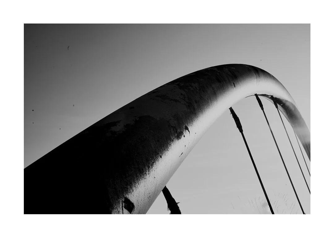
We were taken to a place called 'Rushden Lakes' to visit this really brilliant magazine shops that stocks just about every publication you can think of. Including a lot of fashion photography magazines I enjoy thumbing through. Also there they have this public right of way and overpass from a busy main road that spirals round in a sweeping arch. It caught my eye the previous time I went there, so this time I took my trusted Nikon and captured it with the help of Amy.
Projects - 'Architectural Metaphor' Updates
Just to start off with a look over some architecture this month, with some brutal 1970's car park design amongst others As well as an old and faded art deco veneer shop front face which used to once be the Co-op.
*NEW* Projects - 'X00 Multiplies'
This is a new gallery project all about buildings and architecture that have a symmetry about them. In point Art Deco design, which sadly they do not have in my town. But they do have some great modern buildings that a designed with thought. It is all in black and white for effect, thank you to Amy for her support.


